Make your loyalty card look professional and on-brand by uploading custom images. Each asset appears in a different place on the card, so it's important to get the sizes and ratios right.
Go to Customize → Loyalty card, choose a wallet, and open Card front to edit its artwork and appearance. The Apple and Google editors have separate settings.
In Card type, choose Apple Wallet store card or Apple Wallet poster, then choose Card front in the next dropdown. Edit the highlighted areas in the preview.
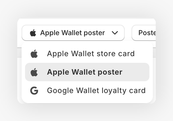
In Card type, choose Google Wallet loyalty card, then choose Card front in the next dropdown. Edit the highlighted areas in the preview.
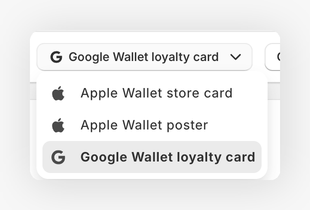
Use the view dropdown to switch between Card front and Details. If your program has tiers, choose a tier from Design above the preview. Its status shows whether it has its own design. Reset returns it to the default design.
All images should be in PNG format. The system will display them across Apple Wallet, Google Wallet, and push notifications.
Edit the texts on the card front 
Every text on the front of the card is editable: the balance, the member name, the tier, and up to two more fields on Apple Wallet. In Card front, click the highlighted area over the texts of the card to open Card front fields.
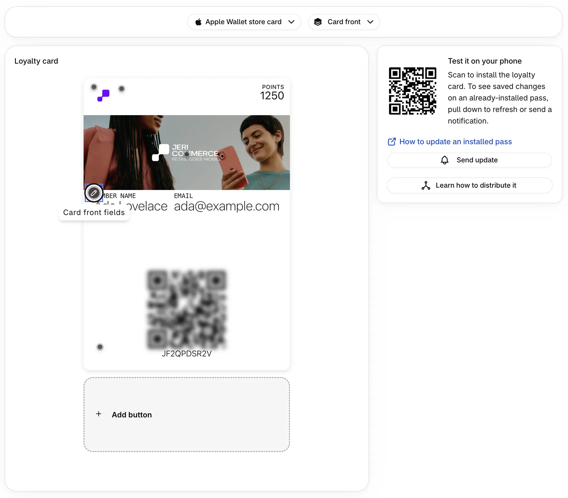
The fields are grouped by where they appear on the card:
| Wallet | Zone | Fields |
|---|---|---|
| Apple Wallet store card | Header | Top right field (the balance by default) |
| Apple Wallet store card | Main fields | First field under the banner to Fourth field under the banner. Click Add field to use the third and fourth |
| Apple Wallet poster | Header | Top right field (the balance by default) |
| Apple Wallet poster | Main fields | First field under the banner to Fourth field under the banner, with Add field |
| Apple Wallet poster | Footer | Poster footer (member since by default) |
| Google Wallet loyalty card | First row and Second row | First row, left field, First row, right field, Second row, left field, Second row, right field |
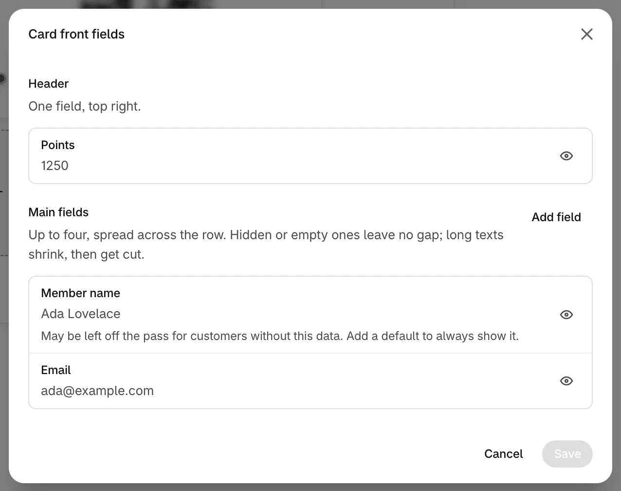
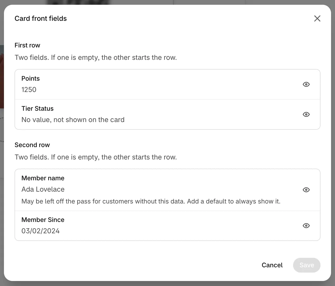
Open a field
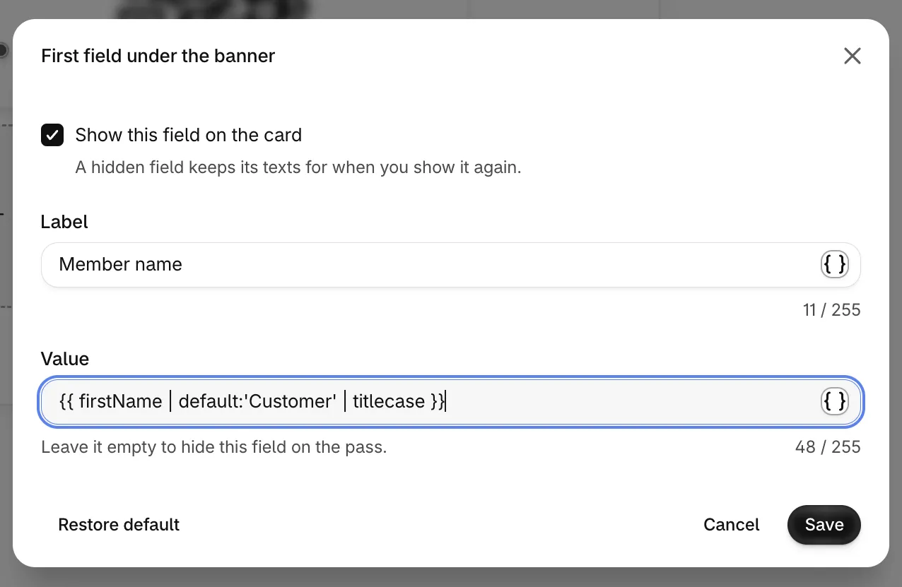
Click a field in Card front fields. The dialog takes the field's name, for example First field under the banner.
Show or hide it
Show this field on the card turns the field on or off. A hidden field keeps its texts for when you show it again. You can also use the eye icon next to each field.
Write the label and the value
Label is the small text above, and Value is the main text. Both accept text and variables with formats, such as {{ firstName | default:'Customer' }}. Click the { } icon to pick a variable. Leave Value empty to hide the field on the pass.
Save
Click Save in the field, then Save in Card front fields. Then click Save in the save bar at the top of the page, or your changes aren't stored. Restore default brings back the field's built-in content.
Keep a few things in mind:
- Each label or value has up to 255 characters. Links aren't allowed on the front: put them in a section on the back or in a button.
- On Apple Wallet, the fields under the banner share one row. Hidden or empty fields leave no gap, and long texts shrink, then get cut.
- On Google Wallet, if one field of a row is empty, the other starts the row. An empty row is left out.
- A field whose value depends on customer data, like the phone or birthday, is left off the card for customers without that data. Add
defaultto always show something. - To hide the points balance, turn off Top right field on Apple Wallet and First row, left field on Google Wallet.
To translate the labels and values, choose a language with the language button below the preview before you open Card front fields. See translate wallet sections.
Google Wallet Icon & Notification Icon 
The Google Wallet icon appears on the front of the Google pass. JeriCommerce also uses an icon for push notifications on iOS and Android.
| Requirement | Value |
|---|---|
| Aspect ratio | 1:1 |
| Minimum size | 840 × 840 px |
Apple Pass Logo 
The logo sits at the top-front of the Apple Wallet pass. If you also show a pass title, the logo shares the space with it. Otherwise, the logo displays alone. Click the title on the preview to open Edit pass title, where you can change it, translate it, add variables or turn off Show this field on the card to hide it.
| Requirement | Value |
|---|---|
| Aspect ratio | 1:1 or 3:1 |
| Recommended size (1:1) | 512 × 512 px |
| Recommended size (3:1) | 1536 × 512 px |
Apple Strip Image & Google Hero Image 
The editor uses separate artwork for each wallet. The Apple strip image fills the wide artwork area near the top of the pass; the Google hero image appears at the bottom.
| Requirement | Value |
|---|---|
| Aspect ratio | 3:1 |
| Recommended size | 1032 × 336 px |
The banner dimensions can vary slightly depending on the wallet app. Keep the most important content in the center and leave a 10% safe area around the edges.
Initial Banner (Overlay) 
The initial banner is an overlay that appears on top of the main banner when the card is first installed. It helps customers understand they need to tap the three dots to see their card details. The overlay disappears once the customer taps any back link.
Find this option in the advanced banner settings, right below the main banner image upload.
New programs start with a transparent overlay template, so the main banner stays visible without instructional artwork until you upload an overlay. Apple Wallet and Google Wallet keep separate overlay outputs so each platform can render the design correctly.
Use transparency in your initial banner so the main banner shows through behind it. Match the same size and ratio as your main banner image.
Apple Poster Artwork 
Poster artwork fills a portrait canvas. Keep the main subject near the center because Wallet crops the image to fill the canvas, and the barcode and bottom strip cover part of it. Treat any safe-area diagram as an estimate, not a guaranteed boundary.
| Requirement | Value |
|---|---|
| Canvas size | 358 × 448 pt |
| Recommended image size | 1074 × 1344 px |
Advanced Wallet Settings 
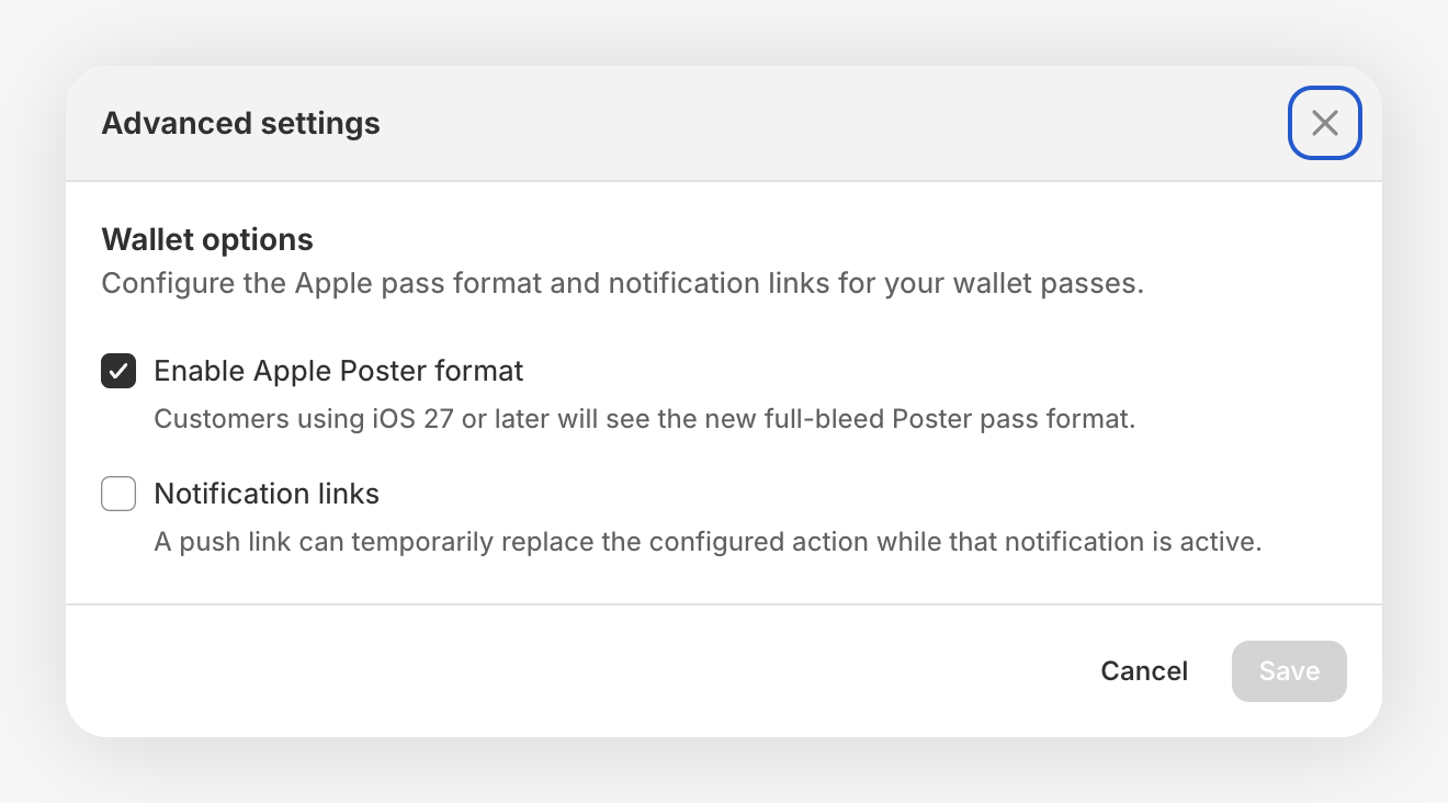
Open More actions → More wallet settings to find the Apple pass options. Turn on Enable Apple Poster format to show the full-bleed Poster pass to customers using iOS 27 or later. Customers on earlier iOS versions see a Store card generated from the Poster design. Store card is read-only while Poster is active.
The same dialog includes Notification links, which lets an active push notification replace the actions below the pass. See how notification links work before choosing this setting.
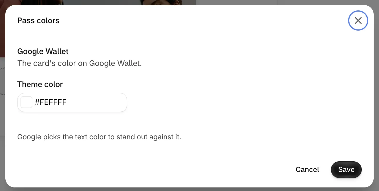
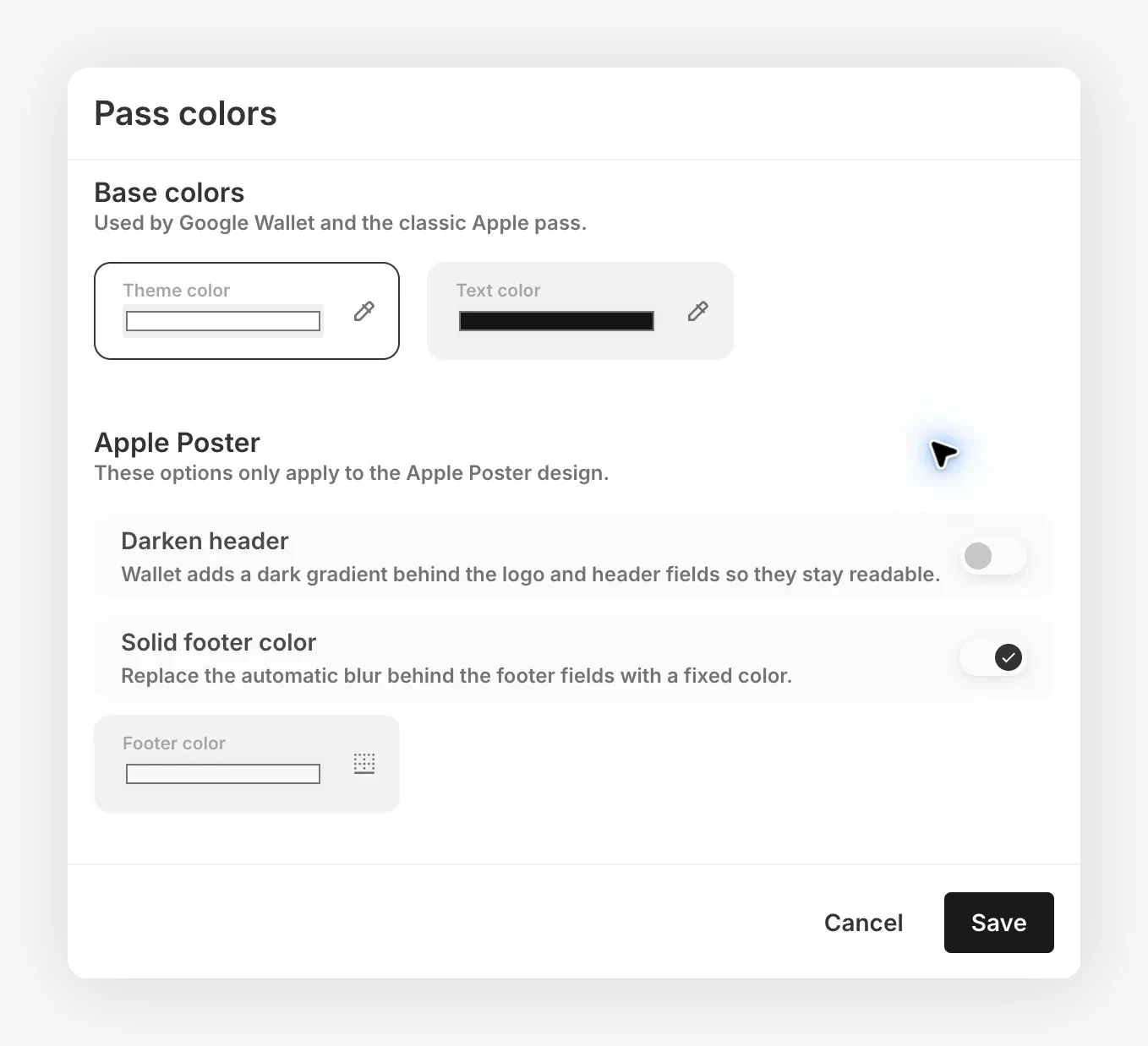
Click the colors area on the preview to open Pass colors. The dialog shows the colors of the wallet you're editing:
- Apple Wallet store card: Theme color for the background and Text color.
- Google Wallet: Theme color, the card's color on Google Wallet. Google picks the text color to stand out against it.
- Apple Poster: the Poster header darkening, footer background, and label color. JeriCommerce also requests automatic text colors for Poster artwork. Check the result on a device because iOS may not apply the requested colors. On iPhones before iOS 27 the pass shows as the store card, with its colors.
Set up Wallet actions 
Actions are set separately for Apple Wallet and Google Wallet at the program level. Choose from membership, rewards, coupons, earnings, referrals, transactions, online store, or a custom destination. A custom destination can be a web address or a customer app page.
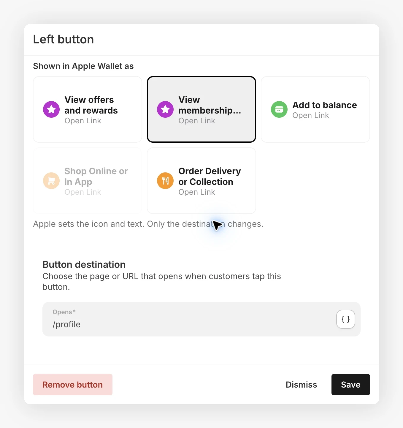
Apple Wallet supports up to two action tiles. Choose a different Apple action type for each tile. Apple Wallet supplies each tile's label and icon from the selected type, so you cannot write a custom tile label.
The primary action is labeled Left button in the editor, and the secondary action is Right button. For loyalty passes, Apple offers five action types: View offers and rewards, View membership benefits, Add to balance, Shop Online or In App, and Order Delivery or Collection. The Opens field takes the destination as text. Enter a web address, a customer app page, or a custom link supported by your program.
Google Wallet supports one button on the front of the pass and a separate link in the pass details. Configure the button and details link independently.
Use push notification links 
In Customize → Loyalty card, use the program's default design rather than a tier-specific design, then open More actions → More wallet settings. In the Advanced settings dialog, Notification links controls the buttons below the pass on both Apple Wallet and Google Wallet. It is on by default.
When a push notification includes a link, this setting lets customers open that notification's destination from the card instead of the usual button destination:
| Wallet | While the notification link is active |
|---|---|
| Apple Wallet (iOS 27 or later) | A reward or marketing notification with a link replaces the configured action tiles with one action that opens that link. |
| Google Wallet (Android) | The front button opens the notification link and uses the notification text as its label. |
The replacement is temporary. Your configured actions return when the pass no longer carries that active notification link. Turn Notification links off to keep the usual buttons during notifications. Click Save in the dialog, then save the card editor. This does not turn off push delivery or remove notification links from the pass details.
Apple needs at least one configured action to show a tile. Google needs a configured button or details link to show the notification button. Without these, the notification link stays in the pass details rather than creating a button below the card.
When you rename the program or change the wallet card title, JeriCommerce updates the shared Google Wallet card definition automatically. Existing Google Wallet cards receive the new name without requiring customers to reinstall them. The Google Wallet title can be translated, but it's plain text and doesn't use variables.